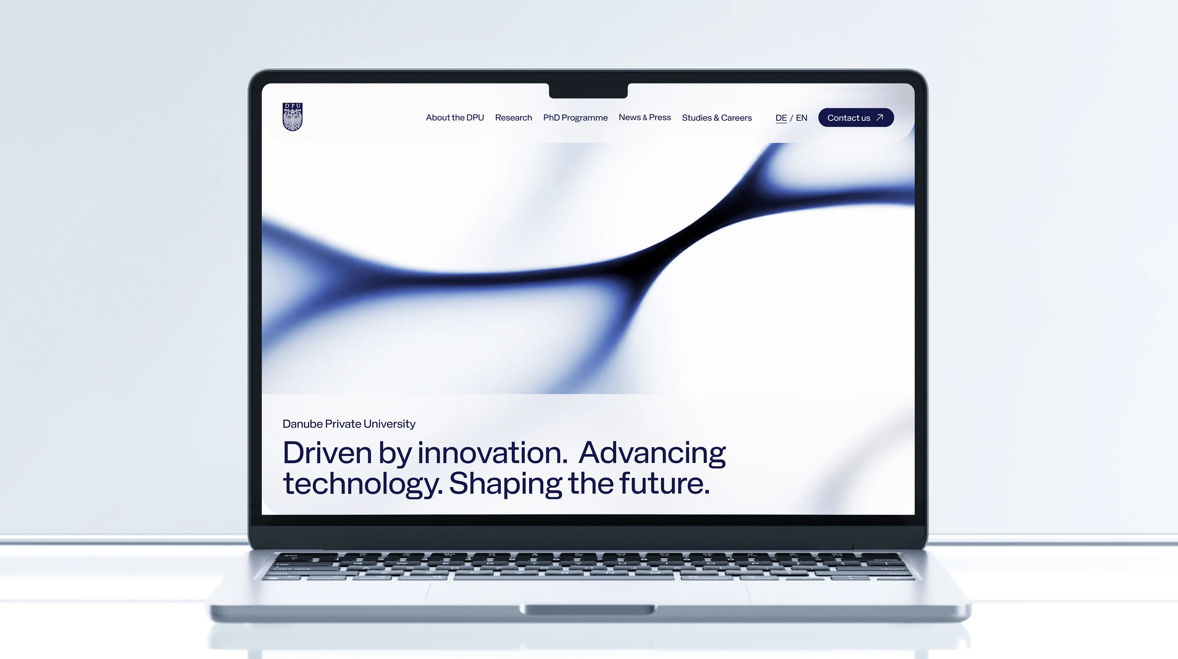
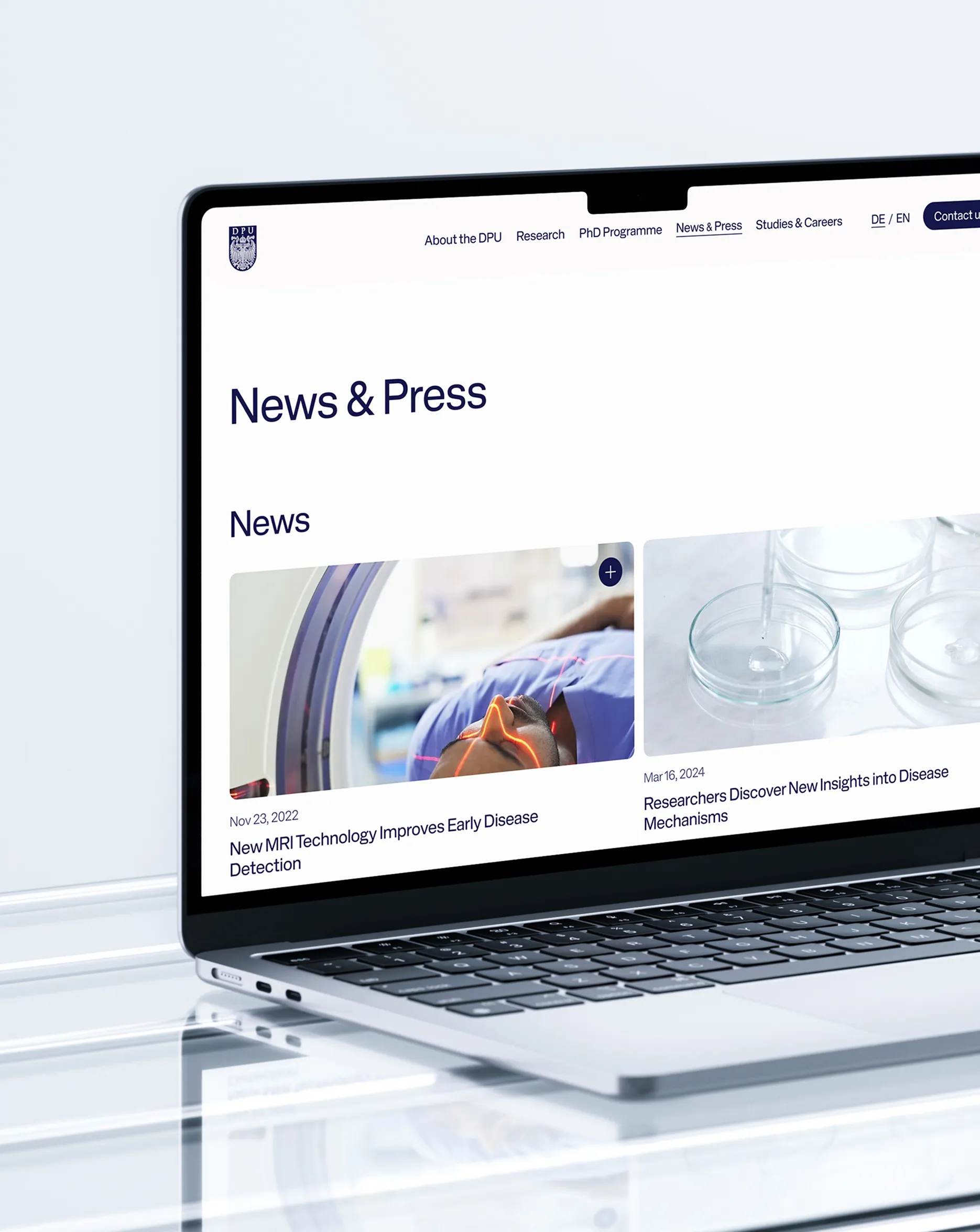
The goal was to design and develop a modern, informative, and easy-to-maintain website for the research departments of Danube Private University. In addition, a brand refresh was carried out, including the creation of individual logos for each research area.
Role
Lead UX/UI Designer
Timeframe (own contribution)
04/2025 – 06/2026
Team
Close collaboration with Web Development (implementation), Team Lead (feedback & sparring), and Project Management
Agency: dotsandlines
Credits: Stefan Ortmair, Hana Salihodzic, Christina Thaller, Andreas Tinoco Lobo, Alexander Lang
An analysis of the existing website revealed several key challenges: a complex and fragmented information architecture caused by a large number of individual pages, an inconsistent visual identity, and content that was difficult to access and in some cases outdated. In addition, research areas and areas of expertise were not presented in a clear and structured manner, making navigation and orientation challenging for users. These findings formed the foundation for developing a clearer site structure, improving the user experience, and establishing a more cohesive visual presence.
Projectgoals & Strategy
In a collaborative workshop, the goals and requirements for the new website were defined. Based on these insights, a clear information architecture and structured sitemap were developed. The focus was on positioning DPU as a modern institution, showcasing its research activities and expertise, and presenting complex content in a clear and accessible way. At the same time, the website was designed to improve navigation, increase its appeal to researchers and partners, and strengthen DPU’s presence as an innovative and internationally connected research institution.
Visual Concept
Based on the sitemap, a modern and minimalist design concept was developed to clearly structure research content and strengthen DPU’s brand perception. The existing color palette was refined to improve consistency and accessibility, while the typography was modernized to enhance readability and establish a clear visual hierarchy. Generous use of white space creates a calm, premium aesthetic and improves overall clarity. A content-first design approach supports intuitive navigation, while subtle blur effects add visual depth and sophistication. In addition, a unified logo system was created for the five research areas, balancing individual recognition with a cohesive overall brand identity.
Interface Design
The visual system was consistently translated into the interface design and implemented responsively across all devices to ensure a seamless and cohesive user experience. Clear content structures, reusable components, and a well-defined visual hierarchy guide users intuitively through the website. Particular emphasis was placed on the quick discovery of relevant information, as well as on creating an accessible and user-friendly experience with minimal barriers to interaction.
Outcome
The new website brings all research areas together on a single, centralized platform and significantly improves navigation through a clear structure and consistent design. Research activities, areas of expertise, and academic achievements are presented in a clear and accessible manner, making complex information easier to explore and understand. The newly developed logo system visually connects the individual research areas while strengthening the overall brand identity and recognition of DPU.
Tools
Figma
Illustrator
Responsibilities
UX Discovery & Strategy
Facilitation of workshops and design reviews with the client
UX Strategy & Information Architecture
UI Design & visual concept
Brand Refresh including Logo Redesign
Creation of interactive prototypes for design sprints
Ensured compliance with WCAG accessibility guidelines
Development Handoff & ongoing collaboration during Implementation